Widget types
Now that you’ve learned how to set up dashboards, you can start to fill them with widgets. To add a new widget, first open the dashboard you’d like to add the widget to and then click the green Add Widget button. This will open the Add Widget pop up, where you can set up your new widget. The first step is selecting the type of widget you’d like to create. Read over the sections below to understand which type of widget best fits your data. Then click on the widget type you’d like to create. In the next lesson we’ll go over how to set the different fields for your widget.
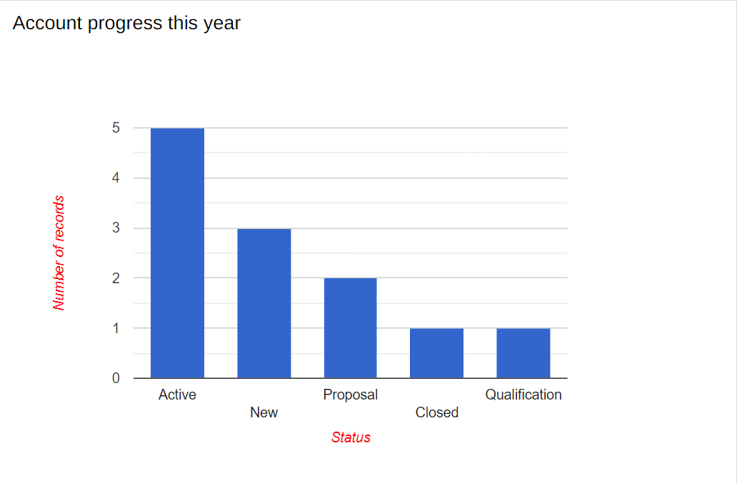
Column widget
This widget displays data in vertical columns, where the x axis shows the values of a specified field, and the y axis shows the relative frequency of each value. For example, the x axis may show the statues of accounts, while the y axis will show how many accounts are found in each status. The columns widget provides a clear and user-friendly overview of performance.
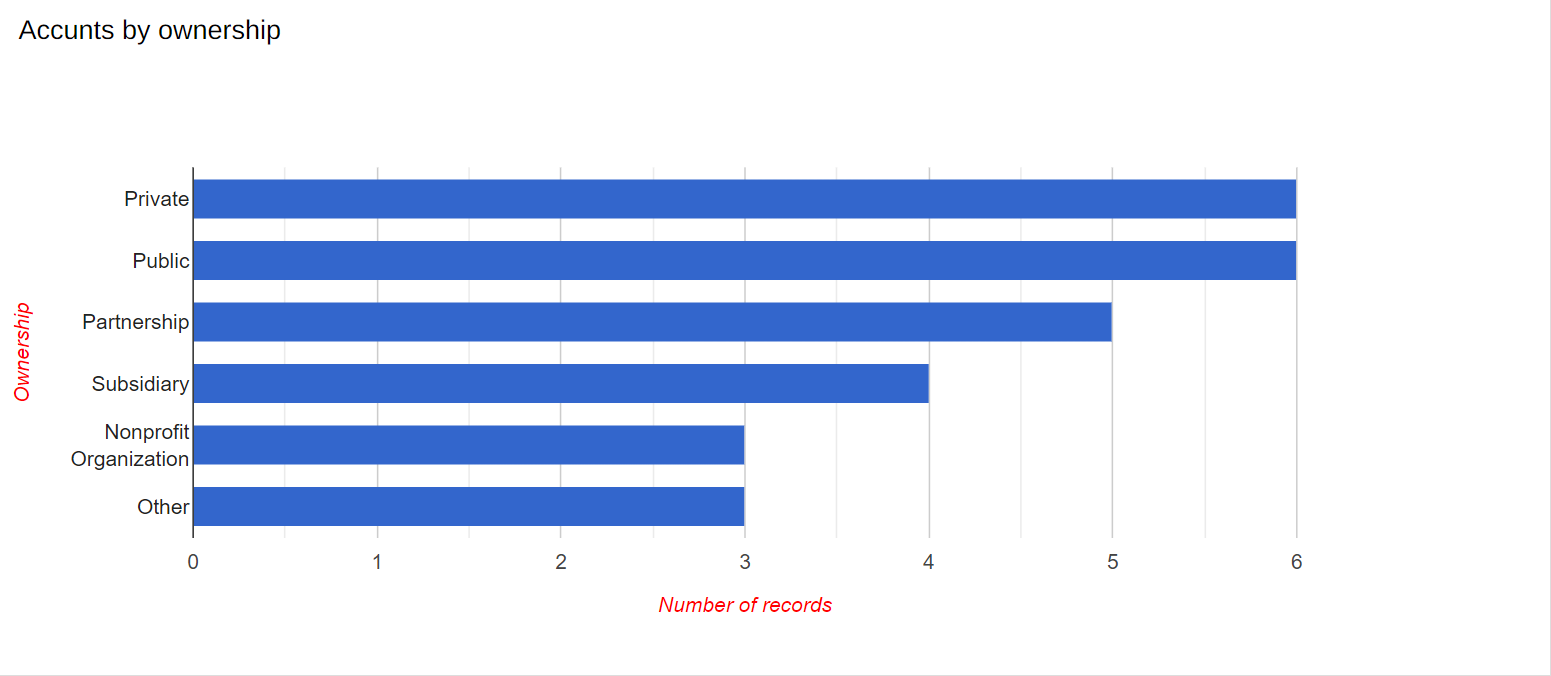
Bar widget
This widget organizes data horizontally, where the y axis lists the values in a specified field, and the x axis shows the relative frequency of each value. For example, the y axis may show the ownership of accounts, while the x axis will show the amount of accounts which belong to each ownership. Using this widget, you can present important information visually, which can lead to useful business insights.
Pie widget
Pie charts are an easy way to visualize the proportional sections of a whole. Each slice is proportional to the quantity it represents in relation to the other slices. For example, the whole pie may represent all the accounts in your system, while each slice represents all the accounts of a specific lead source. Pie charts easily visualize the proportional amount of each section or slice, so you can understand which sections are proportionally larger, smaller, or average sized.

Line widget
Line charts are generally used to show how points of data progress over time. For example, you can display a line which shows accounts by the month they joined. Here the x axis will show the month in the year, while the y axis will show the number of accounts that joined. You can display lines for multiple data types, such as showing a line for the progression of each account type. These widgets are a great way to clearly identify correlation in your data, common trends, and exceptions to these trends.
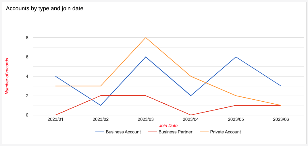
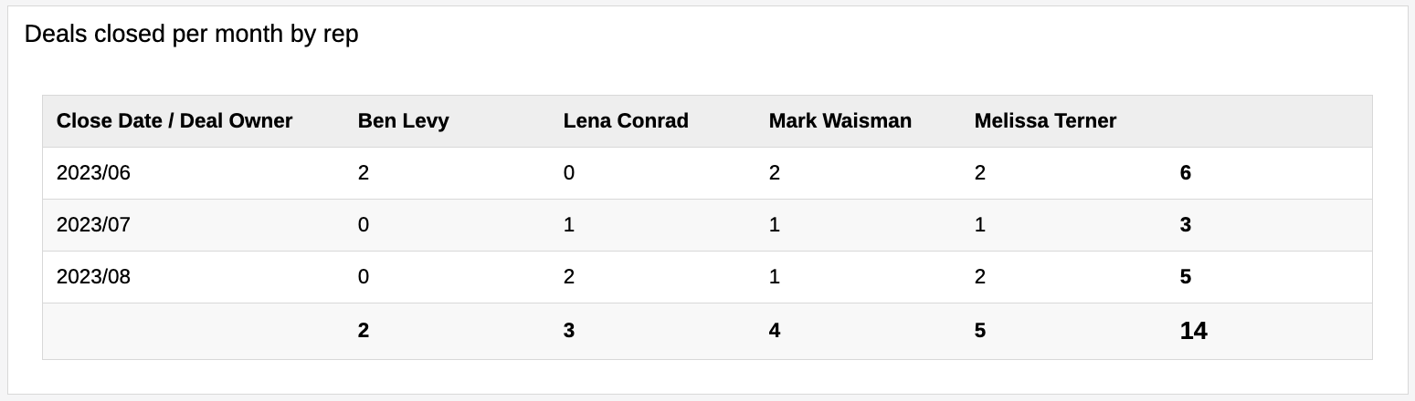
Table widget
You can use the table widget to summarize data with rows and columns. The column headers will contain one field, such as the user, while the row headers will contain a different field, such as the month. The corresponding cell where each row and column meet will display the summarized value of a selected field, such as the amount of deals the specified user closed in the specified month. The table widget is quite useful when you want to display, summarize, and compare numerical data.
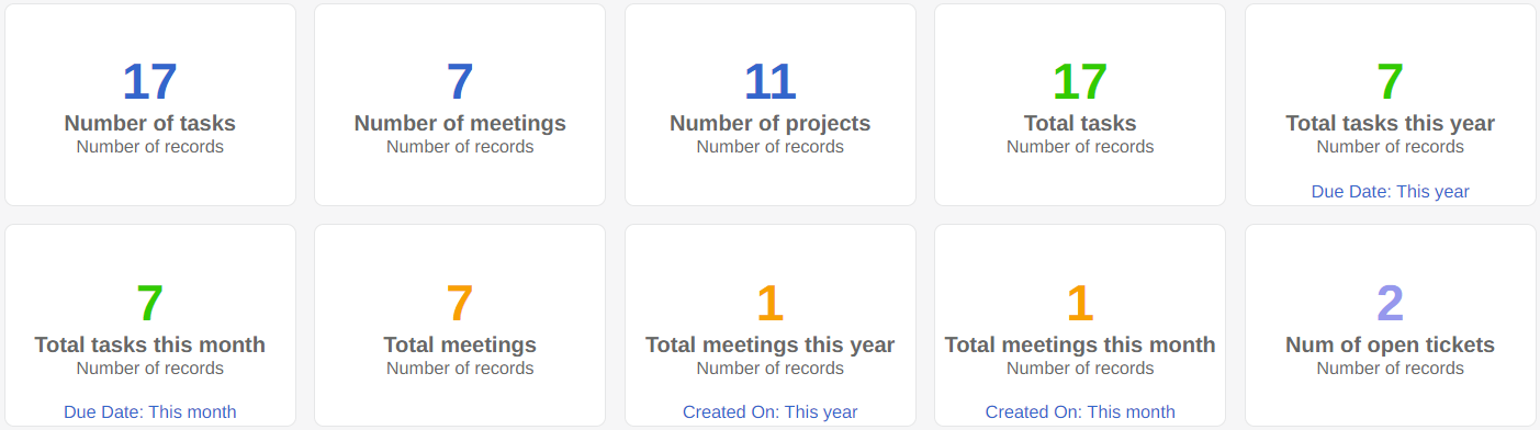
Parameter widget
This widget displays a numerical value for a specified field or object. It can be a sum, average, maximum or minimum value. Parameter widgets are usually used in places where you’d like to calculate a specific piece of data, such as the total number of new customers, average amount of tickets per week, or the maximum budget of a campaign.
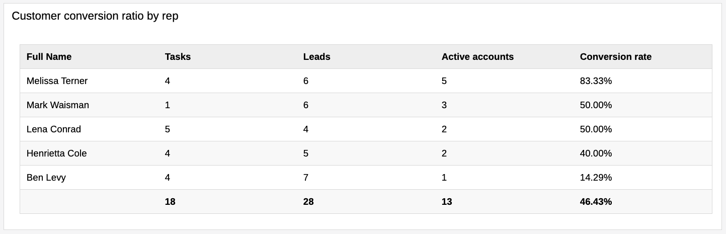
KPI table widget
A Key Performance Indicator (KPI) table can hold and display data from several different objects at once. KPI tables summarize existing objects or fields and can even create formulas based on existing parameters to analyze data. For example, you can summarize each system user's progress from multiple objects like tasks, meetings, and activity logs, or even calculate the conversion rate from leads to active accounts for each user. Using this widget, you can quickly compare and analyze the relationship between different objects or fields displayed side by side using calculated data.
By using these built-in widgets, you can easily analyze any information in your system, find emerging trends, and make important business decisions using all the facts. In the next lesson you’ll learn how to set up your widgets.
Learn about the different widget types which you can add to your dashboards and then use to present and analyze your data.
Course Lessons
Up next